New chart features in SaxoTraderGO
Logarithmic Charts now available in SaxoTraderGO
Logarithmic charts are now available in SaxoTraderGO on both Live and Sim.
Normal charts use a linear price scale where prices are plotted equally on the y-axis. Logarithmic charts plot prices so that there is an equal % change between two prices levels.
For example: on a linear chart a $5 price distance from $20 to $25 is the same distance as from $30 to $35. When plotted on a logarithmic chart, the distance will be different as a change from 20 to 25 represents a 25% increase whereas from 30 to 35 is an increase of just 16.67% thereby a shorter distance when plotted on a chart.
Logarithmic charts can be useful when analysing price movements with large ranges where the data is skewed towards the large values.
In the below chart of the Dow Jones Industrial Index since 1984, the blue chart is plotted on a linear axis and the White chart is plotted on a logarithmic price axis.
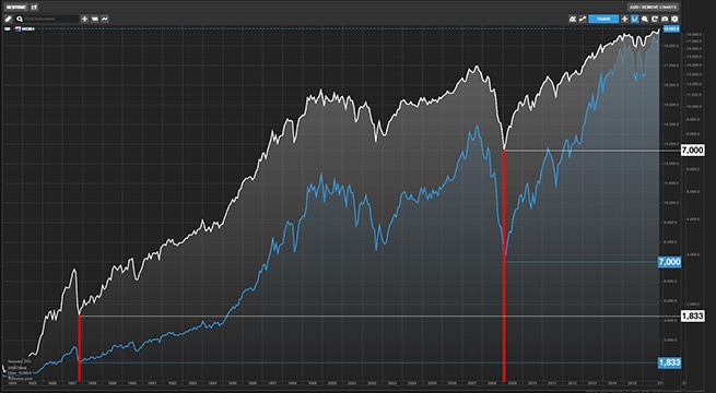
You can clearly see how the 40% market drop in 1987 looks small on the linear chart is much larger on the Log chart. Similarly the market crash during the financial crisis in October 2009 doesn’t look as impressive on the log chart compared to 1987 crash. Also some of the major market movements in the 1970’s are barely recognisable on the linear chart but stands out on the log chart
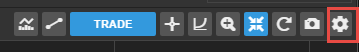
To switch to a Log Chart
To switch to a logarithmic price scale, click the Log chart icon in the chart toolbar.
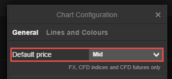
FX chart mid-price option
A new mid-price option is now available on FX charts in SaxoTraderGO.
By default the FX charts use the Bid Price but you could also use the Ask price under the Chart Settings. The Mid- price between the Bid and Ask is now also available from the chart settings.
To use the mid-Price for an FX chart:
- Go to the chart configuration menu
- Click select Mid from the Default Price drop down menu.